We Ran an Accessibility Audit on 154 AI-Built Websites
One text element in five on AI-generated websites fails WCAG AA contrast. The model chose 70 per cent of those colours. We wrote the other 30 per cent ourselves.

9
min read
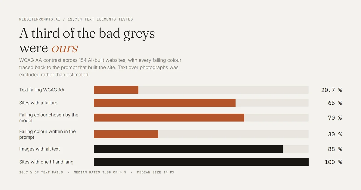
Table of Contents
Two thirds of AI-built sites have a contrast failure. The model picked most of those greys, but a third of them came straight out of the prompt.
Correction, 2 October 2026. The first version of this article blamed the model for the grey. We have since measured where each failing colour came from, and a third of them were written in the prompt. The headline numbers are unchanged. The attribution, and the advice that follows from it, are corrected below.
We tested 11,734 pieces of text across 154 AI-built websites against the WCAG AA contrast requirement. 2,432 failed, which is 20.7 per cent. Two thirds of the sites, 102 of 154, have at least one failure. Only 52 sites are completely clean.
This is not a story about AI being careless in general. The rest of the audit is better than we expected. It is one specific habit, it is easy to describe, and a meaningful part of it turned out to be our own fault.
How we measured it
Each site was loaded in Chromium at 1366 by 900. Every paragraph, heading, link, list item, button and label carrying at least four characters of its own text was inspected: we read the computed text colour, walked up the tree for the nearest solid background, calculated the contrast ratio and compared it against the WCAG AA thresholds of 4.5 to 1 for body text and 3 to 1 for large or bold text.
Where text sat on a photograph, a gradient or a semi transparent layer we excluded it rather than guessing, which removed 5,415 elements from the sample. Text over images is a real accessibility problem, but it cannot be judged from the stylesheet alone, and a smaller honest number beats a larger convenient one.
One detail is worth naming because it invalidated our first attempt. These sites define colours in oklch() rather than rgb(). Our first pass parsed those values as if they were RGB and produced an absurd result, with several sites apparently failing every single element. Converting properly brought the figure from 39 per cent down to 20.7 per cent. If you run this kind of audit yourself, check that before you believe your own output.
The failures are near misses, and that is the whole point
45 per cent of sampled failures sit within 0.5 of the threshold. Text at 4.15 where 4.5 was required.
The median failing element is 14 px, and just under half of all failures are on text smaller than that.
The median failing ratio is 3.89 against a 4.5 requirement.
The median site has 8 failures, covering 14 per cent of its text.
Put those together and the picture is clear. This is not white text on a yellow button. It is the caption under the photograph, the date on the blog card, the secondary line in the pricing table, the small print in the footer. It is the text treated as less important, rendered in a grey that looks refined on a designer's monitor and vanishes on a phone in daylight.
The worst offenders are the sites with the most tasteful palettes. A golf club failed 53 of 79 elements. A funeral home failed 52 of 82. An interior design studio failed 37 of 59. Restrained, muted, expensive looking, and hard to read.
Who actually chose that grey
Our first version assumed the model invented these colours. Because we write the prompts ourselves, we could check, so we did. For every failing piece of text on every site whose prompt defines a palette, we compared the colour the browser painted against the colours the prompt specified.
70 per cent of failing text uses a colour the model chose on its own, with no equivalent anywhere in the prompt.
30 per cent uses a colour that was written in the prompt. We specified it, and the model applied it faithfully.
On 24 of the 94 sites with a defined palette and at least one failure, the prompt is the main cause rather than the model.
We then audited the palettes themselves rather than the pages. Of the twenty prompts written to our current design system, twelve specify a muted text colour that cannot pass WCAG AA against its own background. The pattern is always the same: the muted grey clears 4.5 against the page colour, then fails against the slightly darker surface used for inset panels, which nobody thought to check.
So the model is responsible for most of this, but not for all of it, and the part we own is the part we can fix with certainty. A colour you wrote down is a colour you can test before you press send.
What passed, and it is most things
Every single site had exactly one h1 and a lang attribute on the document. Not one of the 154 got this wrong.
88 per cent of images carry alt text, and only 13 sites had an image missing one.
86 per cent of images use native lazy loading without being asked.
Only 10 per cent of sites overflow horizontally at 375 px width.
The one structural weak spot is touch targets. 150 of 154 sites have at least one link or button under 24 px in one dimension, with a median of 11 per site. Most are text links in a navigation bar or footer, which is the same pattern you find on hand-built sites, but it still deserves a line in the prompt.
Four lines that prevent nearly all of it
Because the cause is narrow, so is the fix. The first line is the one we had to apply to our own library.
Check the colour you are about to specify. Your muted text colour has to clear 4.5 to 1 against every surface it will sit on, not just the main page colour. This is arithmetic, not taste, and it catches the third of the problem that starts with you.
Give the muted colour a floor in the prompt too. State it as a requirement: every text colour, including secondary and caption text, must reach at least 4.5 to 1 against the surface it sits on. Name the muted token explicitly, because that is the one that fails.
Set a minimum text size. Nothing below 14 px, and captions at 13 px only where they also clear 4.5 to 1. Half the failures live under that line.
Set a minimum tap target. Interactive elements at least 24 by 24 px, or 44 by 44 px to meet the stricter mobile guidance.
There is a slightly embarrassing proof that the model will comply when asked. One project in our library needed a second AI pass, and its commit message reads, in full, Contrasted hero text on dark. It fixed the contrast the moment it was told to. It simply did not think to do it first, and neither did we.
Why this matters beyond compliance
Accessibility arguments usually get made on legal grounds, which is fair and completely unpersuasive to someone building a page for their own small business. So here is the practical version.
A contrast ratio of 4.15 is not a technicality. It is the difference between a price being read and being skipped, on a phone, at arm's length, in a bright room, which is where a large share of your visitors are. The audit above is really a readability audit that happens to have a standard attached.
And unlike most of what a prompt controls, this one is free. Lifting a muted grey from 4.1 to 4.6 costs nothing, changes nothing anyone will notice in a side by side, and makes the page work for the visitor standing in the sun. In our own library the corrections were shifts of at most twelve points of brightness, with the hue untouched.